Execution plans you can actually read.
If you have ever run EXPLAIN on a complex query, you know the frustration: a massive block of nested text, rows of confusing JSON, or ASCII art trees that require a PhD in database internals to understand. You end up scrolling back and forth trying to match parent IDs, compare estimated vs. actual row counts, or spot which table scan is eating up 90% of the runtime.
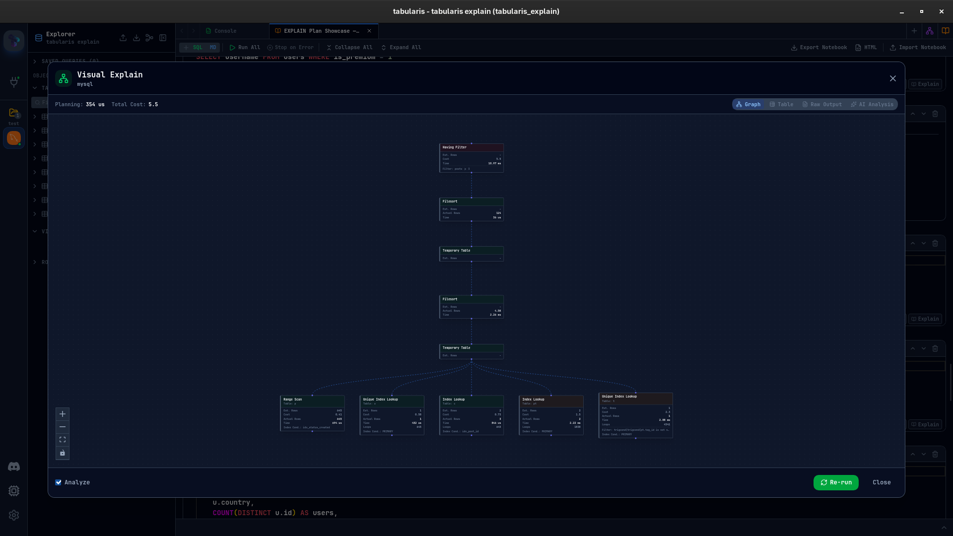
Tabularis turns query tuning into a visual workflow. Select your query, click EXPLAIN, and Tabularis automatically runs the correct engine-specific syntax, parses the raw output, and renders it across four interactive views — graph, table, raw output, and AI analysis.
Video unavailable
Why traditional EXPLAIN is hard
Most SQL clients just output whatever the database returns. While that is fine for simple queries, it fails when:
- Plans get large: A query with 4+ joins yields a multi-level plan that spans screens. Finding the bottleneck is a needle-in-a-haystack problem.
- Estimates lie: A plan might estimate 10 rows but actually scan 10,000. Spotting this "estimate gap" requires manual subtraction across many columns.
- Syntax differs: PostgreSQL uses
EXPLAIN (FORMAT JSON, ANALYZE), MySQL 8 usesEXPLAIN ANALYZE, MariaDB uses its own JSON parameters, and SQLite uses parent-child ID mapping. You have to remember the exact syntax for each.
Tabularis handles all of this automatically, abstracting the syntax differences so you can focus on performance.
Four views to analyze performance
Instead of a single text output, Visual EXPLAIN organizes the execution plan into four dedicated perspectives:
1. Interactive Graph View
The execution plan is mapped as a directed graph. Nodes like Seq Scan, Index Scan, Hash Join, and Nested Loop show the exact flow of data.
- Cost Heatmaps: Nodes are color-coded (green to yellow to red) based on their relative execution cost. The slowest node immediately pops out.
- Estimate Gap Warnings: If a node scanned significantly more rows than the optimizer estimated, Tabularis flags it with a warning icon.
2. Hierarchical Tree Table View
A structured table view that lists all plan operations. It is optimized for comparing exact metrics: startup cost, total cost, estimated rows, loops, and index conditions. Selecting any row displays its full details in the side panel.
3. Raw Database Output
The exact text response returned by the server, rendered in a read-only Monaco editor with full search and JSON syntax highlighting. If you need to double-check the raw numbers, they are one click away.
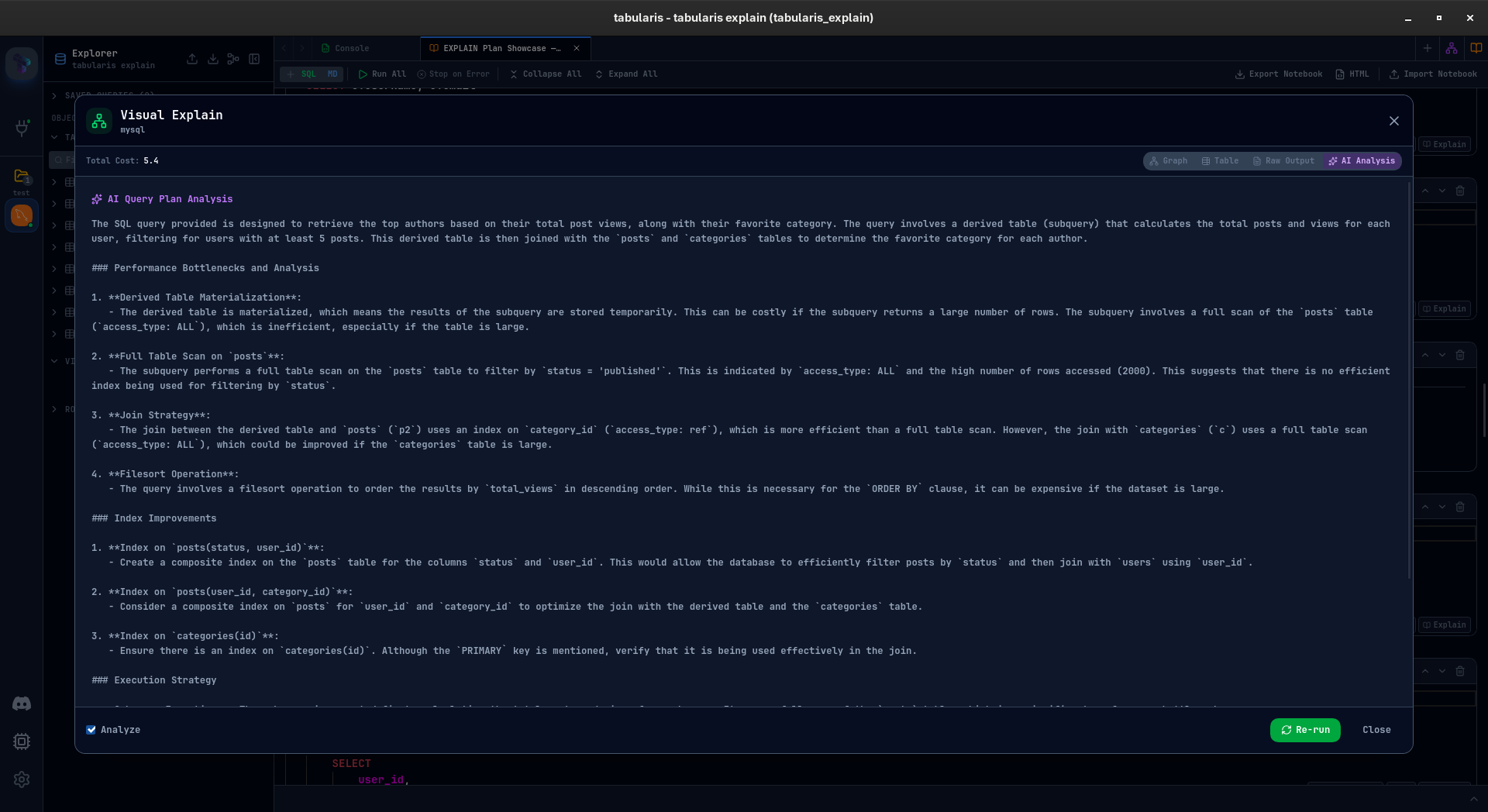
4. AI-Powered Plan Interpreter
Stuck on a complex plan? The AI tab sends the plan and query to your configured LLM (OpenAI, Anthropic, or fully local Ollama models) to get a structured explanation of the bottlenecks, missing indexes, and query rewrites to try.
Database support out of the box
Visual EXPLAIN adapts to the database you are connected to:
- PostgreSQL: Runs with
BUFFERStracking to show disk reads vs. cache hits. - MySQL & MariaDB: Automatically queries the engine version and uses the modern JSON format or
EXPLAIN ANALYZEtrees. - SQLite: Reconstructs tree relationships from SQLite's flat query plan list.
Best fit
- Developers optimizing application query paths.
- DBAs analyzing slow-running database queries.
- Teams looking for visual tools to teach SQL optimization.
- Developers using local databases who want to run timing analyses via
EXPLAIN ANALYZE.
Not the best fit
- Users looking to explain DDL queries (
CREATE TABLE,DROP VIEW) — these statements do not produce execution plans. - Developers who do not use databases with execution plan APIs (NoSQL databases, etc.).