Visual EXPLAIN: Execution Plans You Can Actually Read

Most of the time, you do not look at an execution plan out of curiosity. You look at it because a query is slow, a join is behaving strangely, an index is not being used, or the optimizer is doing something you did not expect. EXPLAIN is the tool you reach for when you need to answer a concrete question: where is the work happening, and why?
The problem is that execution plans are useful, but not especially pleasant to inspect in their raw form. You usually get a tree encoded as indented text, JSON meant more for machines than humans, or engine-specific output that changes depending on the server and version. To get from that output to an actual diagnosis, you have to reconstruct the shape of the plan, compare estimated and actual values, and identify which node is likely responsible for the cost.
Take a plan like this:
Nested Loop Left Join  (cost=4.18..1247.32 rows=2400 width=128)
  ->  Hash Join  (cost=3.75..142.56 rows=800 width=72)
        Hash Cond: (p.category_id = c.id)
        ->  Seq Scan on posts p  (cost=0.00..124.00 rows=5000 width=68)
              Filter: (status = 'published')
        ->  Hash  (cost=2.50..2.50 rows=100 width=12)
              ->  Seq Scan on categories c  (cost=0.00..2.50 rows=100 width=12)
  ->  Index Scan using idx_post_id on comments cm  (cost=0.29..1.35 rows=3 width=64)
        Index Cond: (post_id = p.id)
The information is there, but the inspection work is still mostly manual. You have to read the tree structure, compare node costs, check estimated versus actual rows, and keep the query itself in your head while doing it. On MySQL you also need to know which EXPLAIN format your server version supports. On SQLite you get a flat list with parent IDs and have to rebuild the tree mentally.
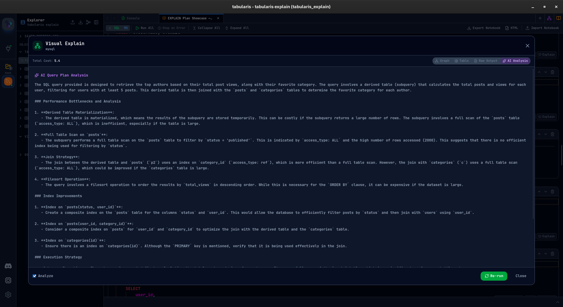
That is the reason for Visual EXPLAIN in Tabularis. The goal is not to replace EXPLAIN, but to make it faster to inspect. Tabularis takes the execution plan, turns it into a graph, highlights the expensive nodes, shows estimated and actual metrics side by side, and keeps the raw output available when you need it. If you want, it can also generate an AI analysis as a second pass over the plan.
It is still in active development on the feat/visual-explain-analyze branch, but it already works on PostgreSQL, MySQL, MariaDB, and SQLite.
How It Works
Select a query and click the EXPLAIN button. Tabularis opens a full-screen modal, picks the right EXPLAIN syntax for the current database, runs it, parses the result, and exposes four views:
- Graph — interactive node tree (ReactFlow + Dagre layout)
- Table — hierarchical tree table with a detail panel
- Raw — the original JSON/text output in Monaco
- AI Analysis — AI summarizes the plan and points out likely issues
The top bar shows the main summary metrics: planning time, execution time, and total cost. You can switch views without re-running the query.
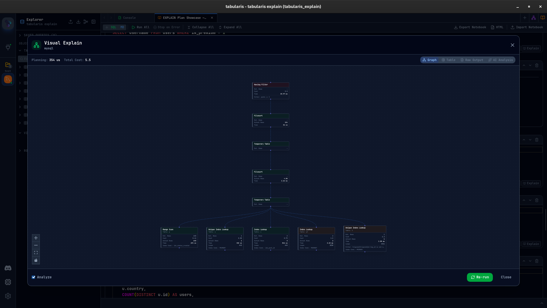
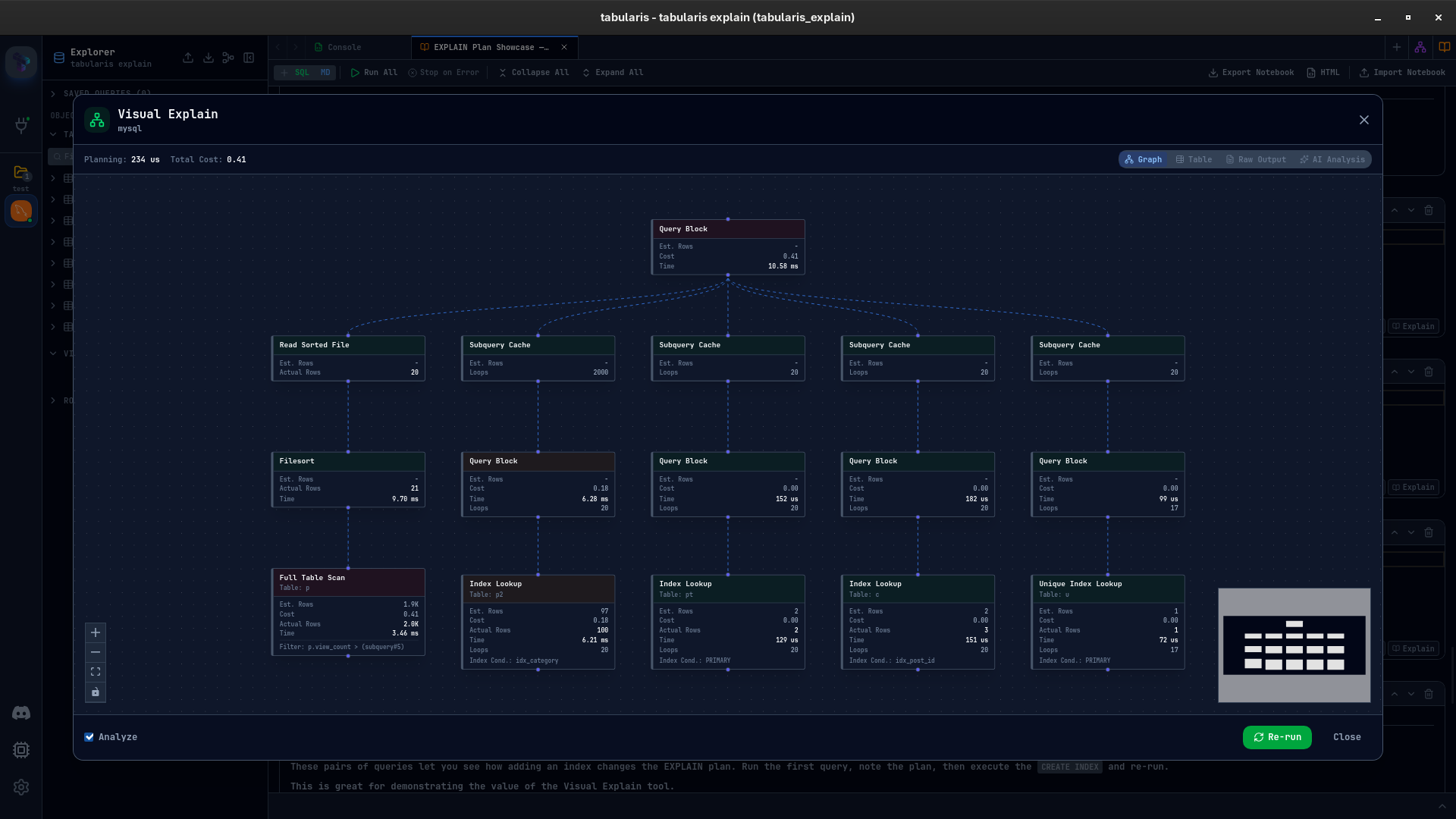
The Graph View
This is the default view.
Each operation in the plan becomes a node. Seq Scan, Index Scan, Hash Join, Nested Loop, Sort, Aggregate: the full tree is rendered as a graph, with edges showing the flow from leaf scans to the final result. Layout is computed with Dagre, so plans with multiple branches stay readable without manual positioning.
Each node shows:
- Node type and relation (which table or index)
- Estimated rows and cost (startup + total)
- Actual rows, time, and loops (when ANALYZE is on)
- Filter and index conditions
Nodes are color-coded by relative cost: green for cheap operations, yellow for moderate ones, red for expensive ones. The scale is relative to the most expensive node in the current plan, so the expensive parts stand out immediately without having to compare raw numbers line by line.
The view supports zoom, pan, and fit-to-view. For larger plans, a minimap appears in the corner.
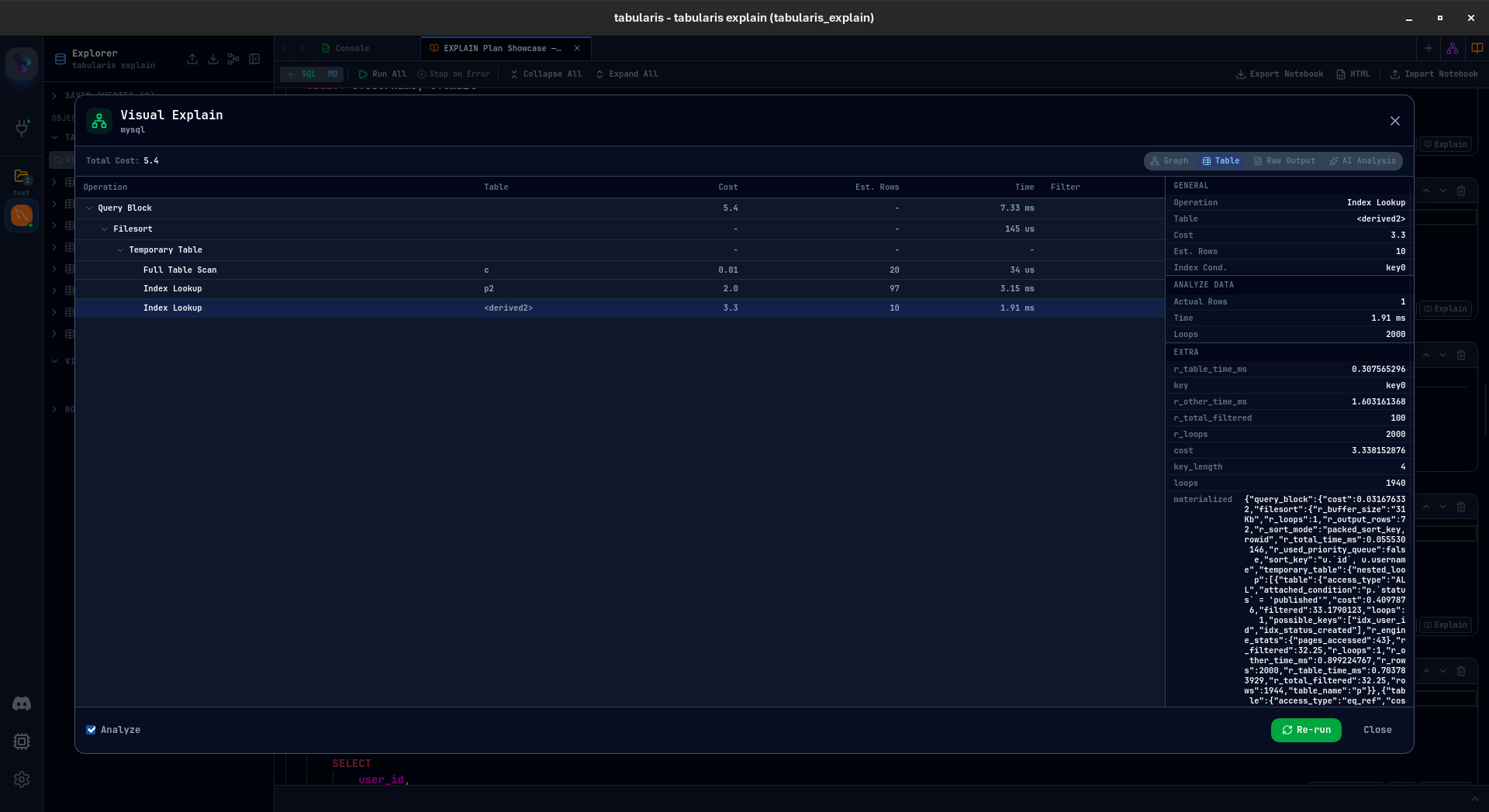
The Table View
The graph is useful for structure. The table is better when you want exact metrics.
On the left there is an expandable tree with columns for node type, relation, cost, estimated rows, time, and filter. Selecting a row opens a detail panel on the right with all metrics available for that node: cost breakdown, actual vs estimated rows, loops, buffer hits and reads, index conditions, hash conditions, and any engine-specific fields present in the source plan.
If you have used EXPLAIN in pgAdmin or DBeaver, the layout will feel familiar. The main difference is consistency: the same view model is used across PostgreSQL, MySQL, MariaDB, and SQLite.
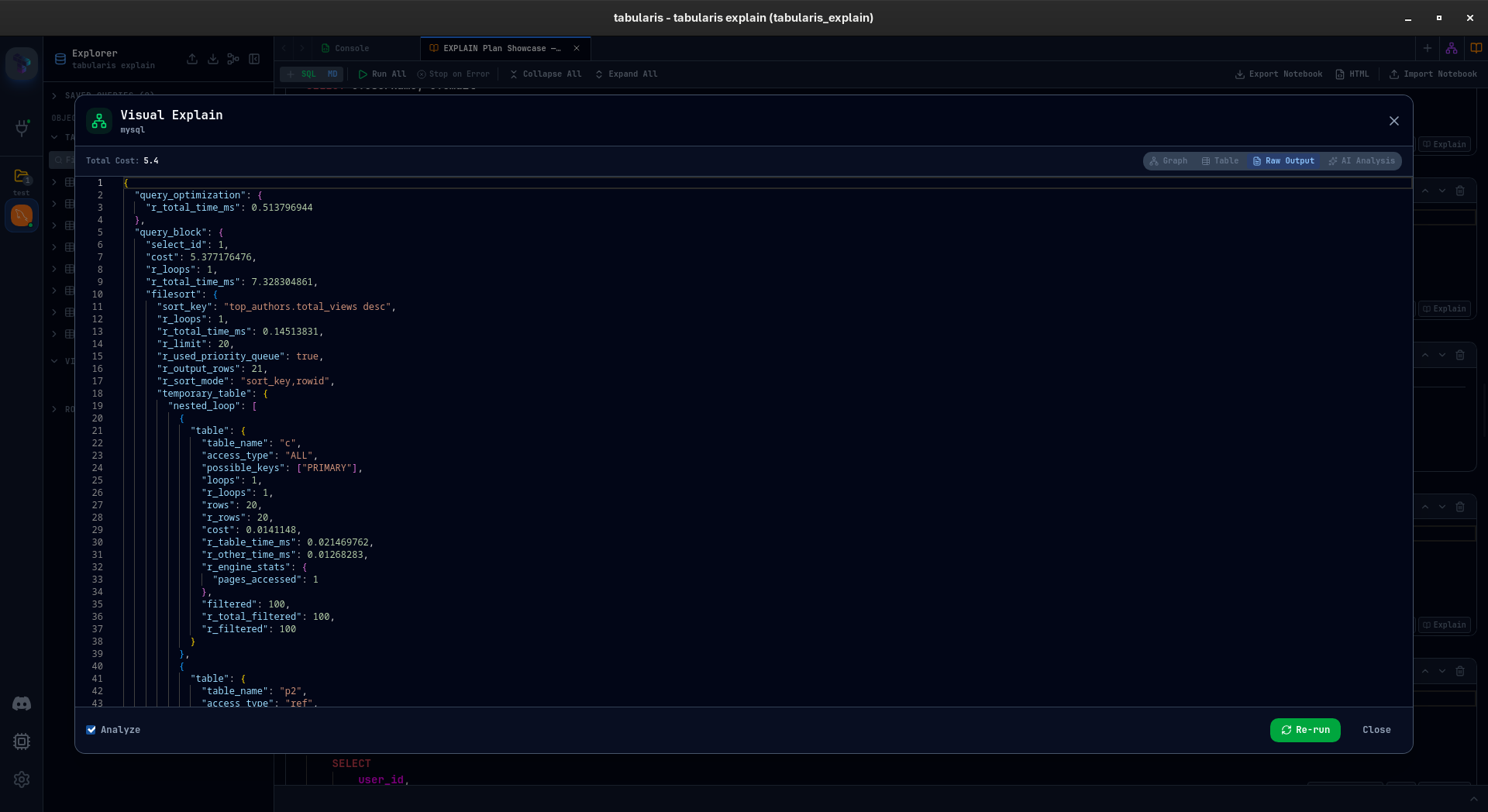
Raw Output
Sometimes you just want the original payload.
The raw view shows the database response in a read-only Monaco editor, with syntax highlighting, wrapping, and search. No transformation, no interpretation.
AI Analysis
The AI tab sends the query and the raw EXPLAIN output to the configured provider and returns a structured analysis: what the query is doing, where the likely bottlenecks are, which indexes may help, and which rewrites are worth testing.
It works with OpenAI, Anthropic, Ollama, and custom OpenAI-compatible endpoints. The response is generated in the language configured in Tabularis, which makes it more practical if you do not normally reason about plans in English.
It is not a replacement for knowing how to read execution plans. It is closer to a second pass over the plan, which is useful when the issue is not obvious or the query is large enough that manual inspection is slow.
EXPLAIN vs EXPLAIN ANALYZE
There is a toggle in the footer. EXPLAIN gives you the estimated plan: what the optimizer expects to happen. EXPLAIN ANALYZE executes the query and reports what actually happened, including actual rows, actual time, loop counts, and, where supported, buffer statistics.
The difference matters. A plan might estimate 100 rows and actually scan 100,000. You only see that with ANALYZE.
ANALYZE is enabled by default, except for data-modifying queries. For INSERT, UPDATE, and DELETE, the checkbox starts disabled and the UI shows a warning. EXPLAIN ANALYZE executes the statement, so treating those queries as read-only would be misleading.
DDL statements such as CREATE, DROP, ALTER, and TRUNCATE are blocked entirely. They are not valid inputs for this workflow, so Tabularis stops them before they turn into opaque database errors.
Multi-Database Support
Visual EXPLAIN adapts to each engine. The differences are significant.
PostgreSQL
PostgreSQL is the primary target. Tabularis uses EXPLAIN (FORMAT JSON, ANALYZE, BUFFERS), which gives structured output with planning time, execution time, buffer hit/read statistics, and the full node tree. All graph and table metrics are derived from that JSON.
This is the most complete implementation right now.
MySQL
MySQL is more version-dependent. Tabularis runs SELECT VERSION(), parses the result, and chooses the best supported format:
- MySQL 8.0.18+ —
EXPLAIN ANALYZE(text tree with actual execution data) - MySQL 5.6+ —
EXPLAIN FORMAT=JSON(structured plan, estimates only) - Older versions — tabular EXPLAIN fallback
There is no manual configuration for this. Detection is automatic.
MariaDB
MariaDB has similar capabilities, but with different syntax and fields. Tabularis detects the MariaDB version string and uses:
- MariaDB 10.1+ —
ANALYZE FORMAT=JSON(executes the query, returns JSON with both estimated and actualr_*fields) - MariaDB 10.1+ —
EXPLAIN FORMAT=JSON(estimates only)
SQLite
EXPLAIN QUERY PLAN returns a flat list of operations with parent IDs. Tabularis reconstructs the parent-child tree from that output. There are no execution metrics because SQLite does not expose an ANALYZE-style result here, but the structure of the plan is still useful.
Finding Tabularis useful? Star it on GitHub — it takes a second and helps more developers discover the project. Star on GitHub
Current State
This feature is still under active development. Current status:
- PostgreSQL is the most complete — full JSON parsing, all metrics, ANALYZE with buffers.
- MySQL and MariaDB work well — version detection, multiple format fallbacks, JSON and text tree parsing. Edge cases across the many server versions in the wild are the main gap.
- SQLite is basic — plan tree is there, execution metrics are not.
- Node interaction — clicking a graph node does not open the detail panel yet. Table view supports it, but the views are not linked.
- Cost bar visualization — proportional cost bars inside graph nodes, not just border colors.
- Plan comparison — EXPLAIN before and after a query or index change, side by side. Planned, not implemented yet.
- Plugin drivers — community database drivers can implement
explain_queryin the driver trait and get Visual EXPLAIN for free.
Contributions Welcome
This is open source, and there are several places where contributions would be useful.
If you know PostgreSQL internals well, the parser can expose more node-specific details such as parallel workers, CTE scans, and materialization hints. If you use MySQL or MariaDB heavily and run into parsing edge cases, bug reports with the raw EXPLAIN output are especially helpful. If you want to work on visualization, there is room for better layouts, cost distribution views, and comparison workflows.
The driver trait defines a standard explain_query interface. Any community plugin that implements it gets Visual EXPLAIN automatically.
Development is happening on the feat/visual-explain-analyze branch. Issues and PRs are welcome on the GitHub repository.
Why This Matters
Every database has some form of EXPLAIN. Very few database clients make it easy to work with.
In practice you usually get raw text, a table with overloaded columns, or a static tree that is hard to inspect once plans get larger. The underlying data is useful. The presentation is usually not.
The result is predictable: people delay looking at the plan until a query is already causing trouble, and then they spend time decoding output instead of fixing the actual problem.
Visual EXPLAIN is an attempt to make that workflow shorter. Run the query, inspect the plan in the same client, identify the expensive nodes, and iterate without copying JSON into external tools or switching to another application.
It is landing soon. Progress is tracked on feat/visual-explain-analyze.
Try It Yourself
If you want to test Visual EXPLAIN on MySQL or MariaDB, I put together a demo database and a Tabularis notebook with more than 25 queries covering table scans, index access patterns, joins, subqueries, CTEs, aggregations, UNIONs, and deliberately expensive cases.
explain-demo-database.sql— MySQL/MariaDB schema with ~15k rows across 8 tables, a mix of indexed and unindexed columnsexplain-showcase.tabularis-notebook— importable notebook with annotated queries, one per optimizer strategy
Run the SQL file on your server, import the notebook into Tabularis, and click Explain on any cell.