

Tabularis.dev did its job well. It was built by developers whose expertise is databases and desktop software, not frontend, and AI helped them build a solid site quickly. It presented the project clearly and helped it reach a growing community.
But a project doesn't stand still. As Tabularis grew, with more features, more plugins, more docs and more new visitors, the site had more to say than its original structure could hold. The goal of the rebuild wasn't to fix something broken, but to give the site room to grow with the project.
Here is how the rebuild went, and what each step taught me.
Understand what already exists before changing anything
Before opening any design tool, I reviewed the site page by page: what was there, what each page was trying to say, and where a first-time visitor would probably get lost or leave.
Three things stood out. The navigation and the page hierarchy were not obvious to someone arriving for the first time. Some content was dense where it should have been easy to scan. And the homepage, the page that matters most for convincing someone to stay, described the project without really explaining why it was worth trying.
Here is what the top of the homepage looked like before the rebuild:
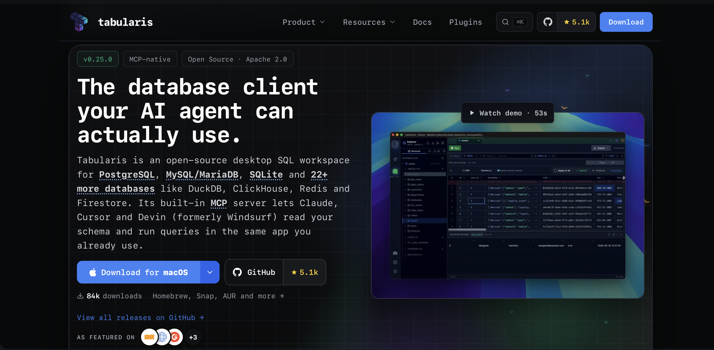
The homepage hero before the rebuild.
I also looked at how well-known developer tool sites handle the same problem: Stripe, Vercel and Linear. The goal was not to copy their look, but to learn from two things. First, their navigation stays simple as the product grows, with a few clear entries instead of links to everything. Second, their design is consistent: the same spacing, the same type sizes and the same few colors on every page. This meant I didn't have to guess what "clean" looks like. I could reuse rules that already work.
Prototype before writing code
Next, I moved to Figma. There were no formal rounds of review, just a continuous process: sketch a direction, test it with the real content, adjust, and move on to the next page.
Deciding the structure of a page in Figma is much cheaper than changing it later in code. It also gave everyone something concrete to react to before any development started.
Question every piece before keeping it
For each page, I asked whether every section was really useful, instead of keeping it just because it was already there.
The homepage features section was the clearest example. It had 14 feature cards, all with the same visual weight. I kept the 4 that matter most for a first visit, and moved the full list to the solutions page, which is linked from the homepage. Fourteen cards of equal importance don't help a new visitor understand a project, they only delay the moment they decide whether it's worth their time.
Two other sections were removed: one about the app's visual themes, and one introducing the wiki. Both have their place on the site, but not on a homepage whose job is to convince first-time visitors.
The other pages went through the same review, including the download page, the compare pages and the plugin bounty board. The question was always the same: does this help the reader make a decision, or is it here only because it was easy to add?
The bounty board is a good example. Its header used to show a complex driver map with thirteen targets, four status colors, a legend for those colors, and three buttons, all before the visitor had finished reading the title. The new version has the same goal, showing which databases still need a driver, but it uses six database logos around the Tabularis logo and two buttons instead of three. The information is the same, and it's much easier to read.
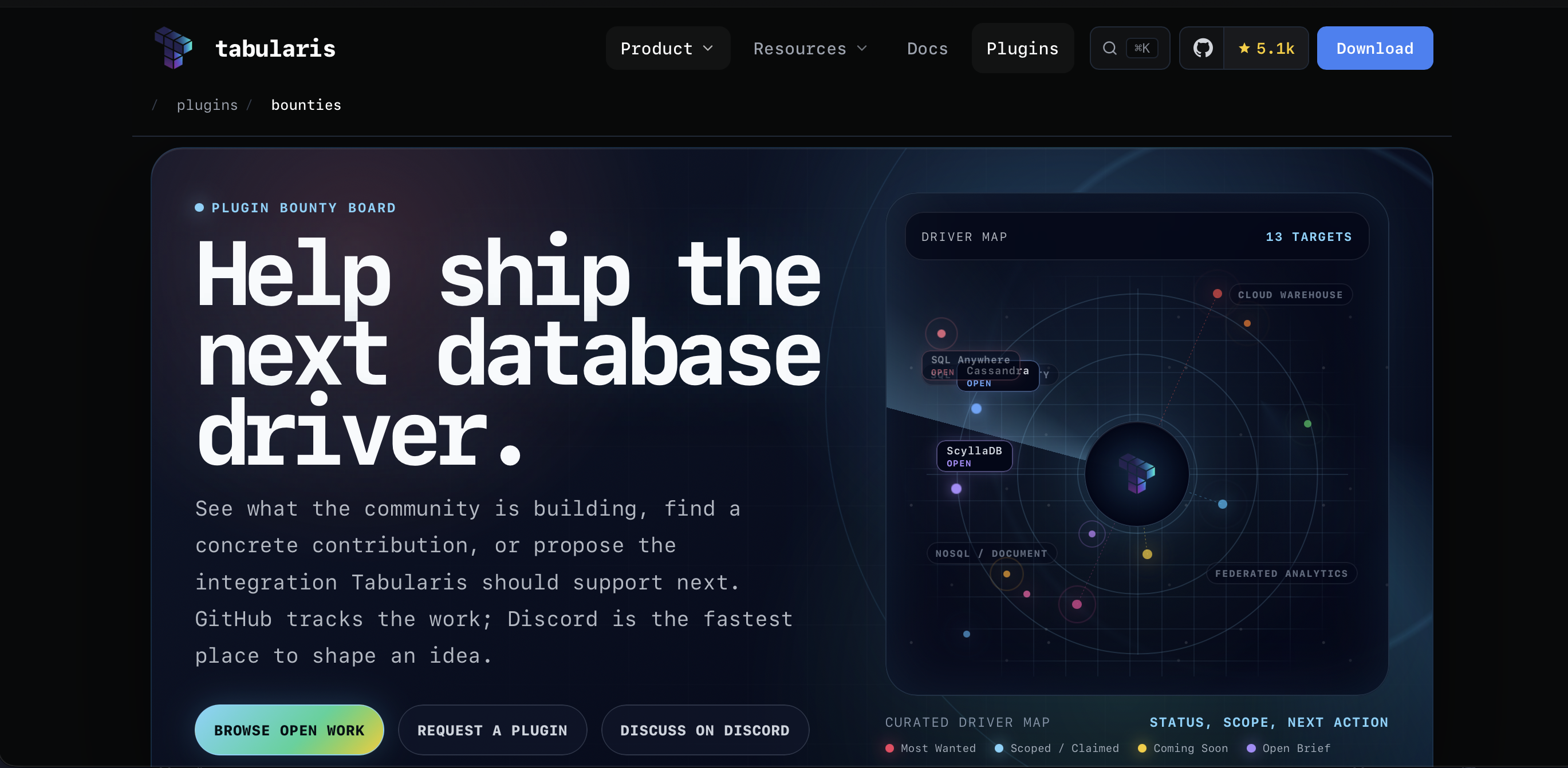
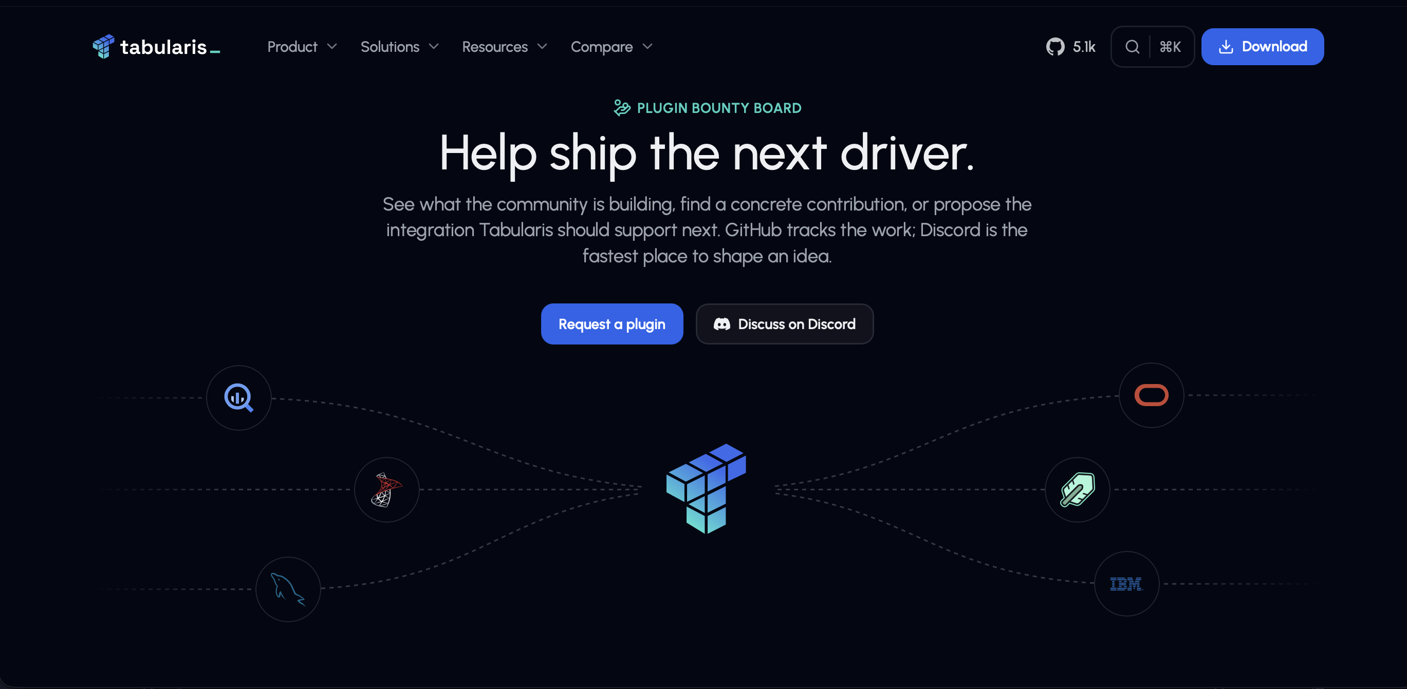
The bounty board header, before (left) and after (right).
Make the visual identity consistent
Removing what wasn't needed was only half of the work. The other half came from the lesson of Stripe, Vercel and Linear: a site looks clean when the same few rules are used everywhere.
Tabularis didn't have those rules yet. There was only one logo file, also used as the favicon, and the whole site used a monospace font, even for body text. Each page also had its own style, with different spacing, different cards and different uses of color. Going from one page to another felt like visiting different products.
Now the whole site shares one visual language. It uses two fonts, each with a clear role: Urbanist for the interface and for reading, and JetBrains Mono only for code and data. It has one color palette, and the same spacing and components on every page. The logo and the icon now exist in color, white and black, so they work on any background. The brand kit makes all of this available to anyone who writes about Tabularis or builds something around it.
The hardest pages
Two parts of the rebuild took much longer than the rest.
The first was the download page. It looks like the simplest page on the site, since you just pick your platform and get the file, which is exactly why it has to be perfect. Every extra click or unclear option can make someone leave before downloading, so I spent more time on it than its size suggests.
The second was the content pages: blog posts and solution pages. Their content is written in Markdown rather than placed in a fixed layout, so every type of content needed its own design and testing: all heading levels, code blocks, videos and images. A content page is not one component but a small set of components that must look good together, whatever combination an article uses. That made it much harder to finish than a page with a fixed layout.
Fix the foundations, not just the design
A new design on top of the old code would only have moved the problem. So once the design direction was clear, I reviewed the code the same way I had reviewed the pages.
Some parts were in good shape. The routing was well organized, and SEO and Open Graph images were already handled well, better than in most projects of this size.
Other parts were not. All the styles of the site were in a single globals.css file, with about 11,200 lines of code, or 13,000 lines including comments and blank lines. With a file like this, there was no reliable way to know whether a rule was still used. Changing a class was risky, because it might also affect three other pages. Class names conflicted between unrelated components, and the file was too large to work with confidently. The components had the same problem: all 65 of them were in a single folder, with no organization by feature.
The rebuild moved all the styles to CSS Modules, page by page during the redesign, and component by component for shared pieces. Each component now has its own style file next to it, with styles that only apply to that component: about 100 small files instead of one huge one. The components follow the same logic, with shared layout and UI components on one side, and one folder for each part of the site on the other, such as the homepage, the blog, the wiki and the download page.
The global stylesheet is still there, but it went from 13,000 lines to about 300. It now only contains what really needs to be global: shared variables and basic layout classes. Changing the style of one component no longer means checking the entire site.
You don't have to take my word for it: the site is open source, and you can explore its structure in the website repository.
The result
The rebuild took several weeks, alongside other work. Here is how the code changed:
| Before | After | Change | |
|---|---|---|---|
| Files | 145 | 288 | +99% |
| Lines of code | 28,533 | 21,453 | -25% |
| Total lines | 32,295 | 24,338 | -25% |
Almost twice as many files, and a quarter less code. That's not a contradiction, it's the goal: each file now has one clear job, and the code has a logical place instead of piling up in whichever file was already open. There is simply less code to read, review and maintain.
The change is not only in the code. The homepage now explains the project in the few seconds a new visitor gives it, and the next person who works on the site will find code that is easy to change. The best way to judge is to explore the site, starting with the download page or a few demos.
Before your project outgrows its site
If your project is growing and its site "just works", the real question is not whether it looks fine today. It's whether it will still hold up when more people look at it closely, when traffic grows, and after six more months of changes that nobody has planned yet.
Thanks to Debba for the trust and the freedom to rethink everything.
What still feels rough when you visit tabularis.dev? Tell us on GitHub Discussions or Discord.