Themes & Customization
A developer tool should adapt to your preferences. Tabularis ships with a robust, CSS-variable-based theming engine that ensures every pixel—from the sidebar to the SQL editor—feels cohesive.
Built-In Themes
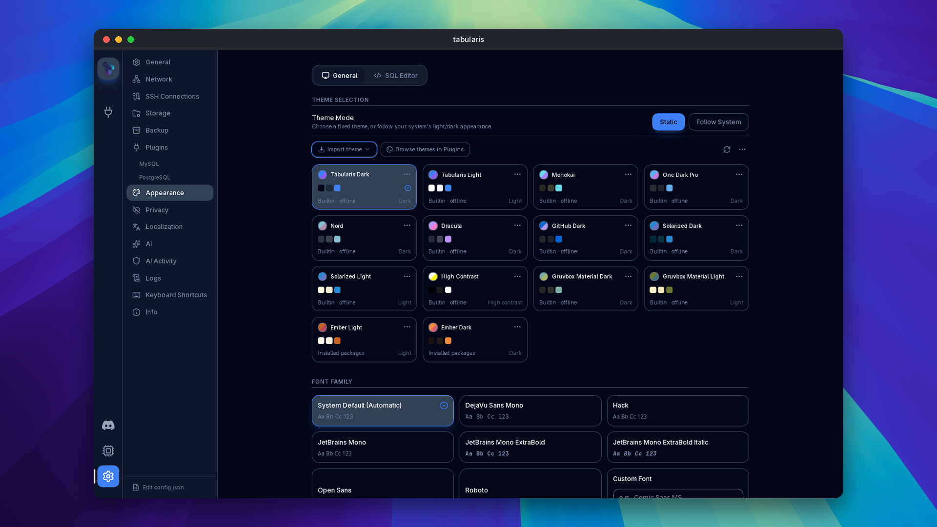
Switch themes instantly in Settings → Appearance. Changes apply immediately without requiring a restart or refreshing the DOM.
- Dark Themes: Tabularis Dark, Monokai, One Dark Pro, Nord, Dracula, GitHub Dark, Solarized Dark, Gruvbox Material Dark, High Contrast.
- Light Themes: Tabularis Light, Solarized Light, Gruvbox Material Light.
Since v0.26.0 every built-in theme meets WCAG 2.2 AA contrast on the color pairs the UI actually paints (text tiers on each background, accent text, labels on accent fills, data colors and the focus border at 3:1). The fixes changed lightness only and kept each theme's hue; the most visible differences are darker status colors in Solarized, Nord and Tabularis Light and a lighter accent and focus ring in GitHub Dark. The check runs in CI on every change, so a new preset or a token change cannot regress it.
Video unavailable
Theme Mode: Static or Follow System
Since v0.22.0 the Theme Mode switch in Settings → Appearance decides whether the theme is fixed or tracks the operating system:
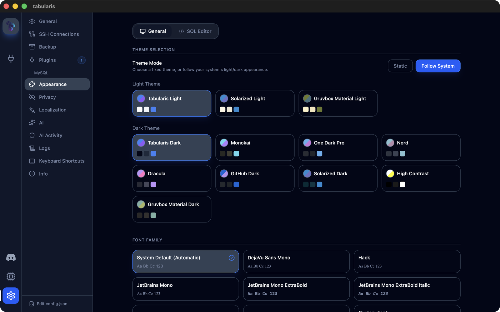
- Static (default): one theme, chosen from the picker, applied regardless of the OS appearance.
- Follow System: two pickers, Light Theme and Dark Theme, each listing only themes of that classification (custom themes are classified by their Monaco base theme). Since v0.24.0, Tabularis uses native appearance signals and Linux desktop-portal preferences to apply the matching pick as the OS switches; the native window chrome follows the system too.
prefers-color-schemeis retained as the browser-preview fallback, rather than overriding a native dark preference with WebKit's light result.
Toggling Follow System applies the current-mode theme immediately. If a picked theme no longer exists (a deleted custom theme, for example), the built-in preset for the current OS mode is used instead, and deleting a custom theme clears any per-mode pick that referenced it. The SQL editor theme is unaffected: Same as App follows the switch, an explicit editor theme stays fixed.
The mode is stored in config.json as followSystemTheme, lightThemeId and darkThemeId. When the fields are absent the app is in Static mode, so existing installs are unchanged. See Configuration.
Theme Packages (since v0.25.0)
Themes are no longer limited to the built-in presets and single-file personal themes. Since v0.25.0 a theme can be distributed as a declarative package: a ZIP with a .tabularium manifest of kind: "theme" and one JSON definition per variant (typically a light and a dark one). A package contains data only. No code is executed, and theme packages never take part in driver activation.
Managing themes
Settings → Appearance → Manage themes lists built-in, personal and installed themes together.
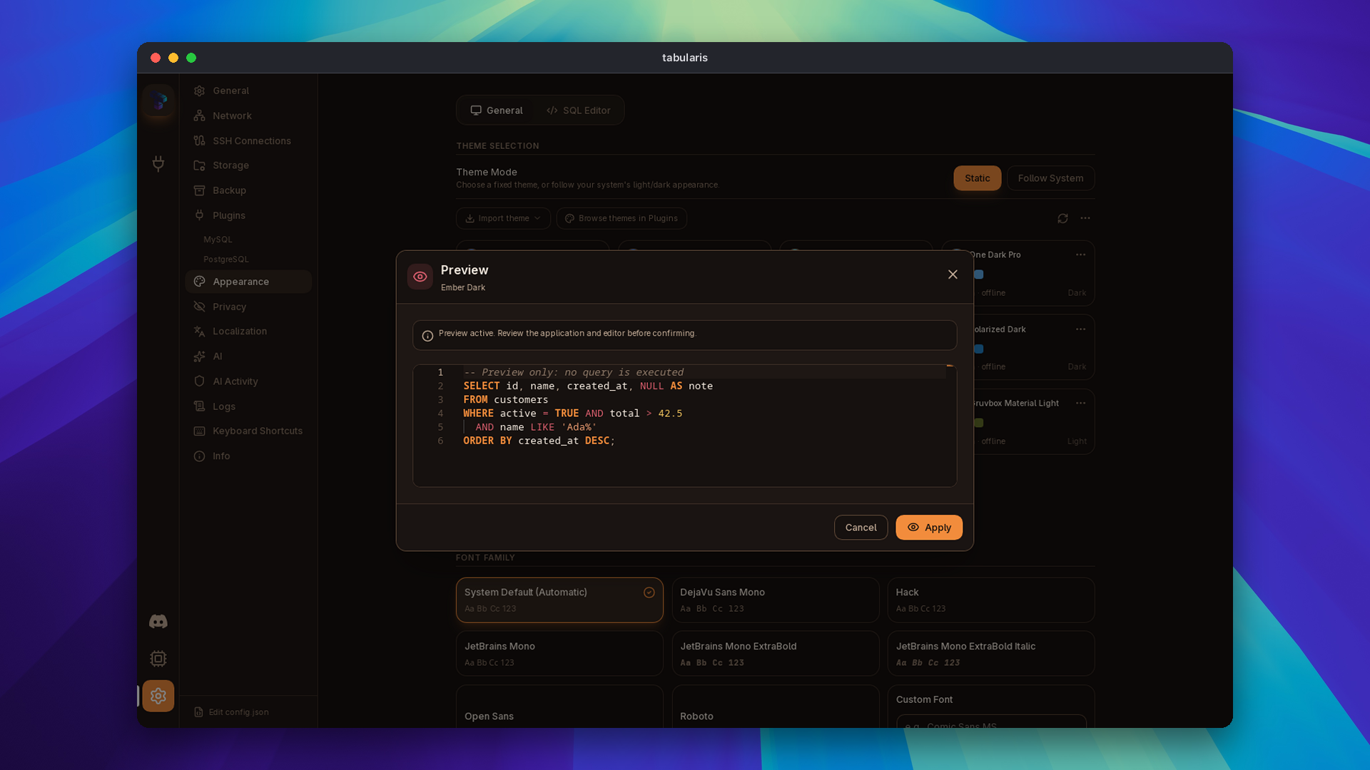
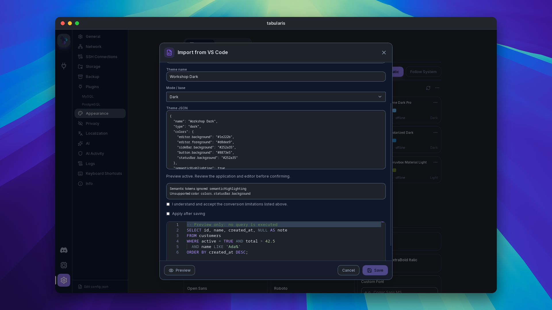
- Preview applies a theme temporarily and shows a read-only SQL sample rendered with the shared Monaco renderer. Cancel or Escape restores the saved selection, taking the current system mode into account; Apply saves it.
- Installed packages are read-only. Duplicate as personal creates an independent copy that Edit personal theme can change.
- The application theme and the SQL editor theme are selected independently. The Follow System light and dark picks work with installed variants.
- Import Tabularis JSON and Export standalone JSON keep the single-file format. Import from VS Code converts a VS Code JSON or JSONC theme, lists what could not be mapped, and asks for the light or dark base when it cannot detect it. Export author package writes the package layout for a theme you intend to publish.
- Local package previews and installs a ZIP from disk. Installation is bound to the validated archive digest: rebuild the ZIP and you preview again before installing.
Installing a package never selects a variant on its own. Close the dialog and pick the variant explicitly.
Video unavailable
Installing from the registry
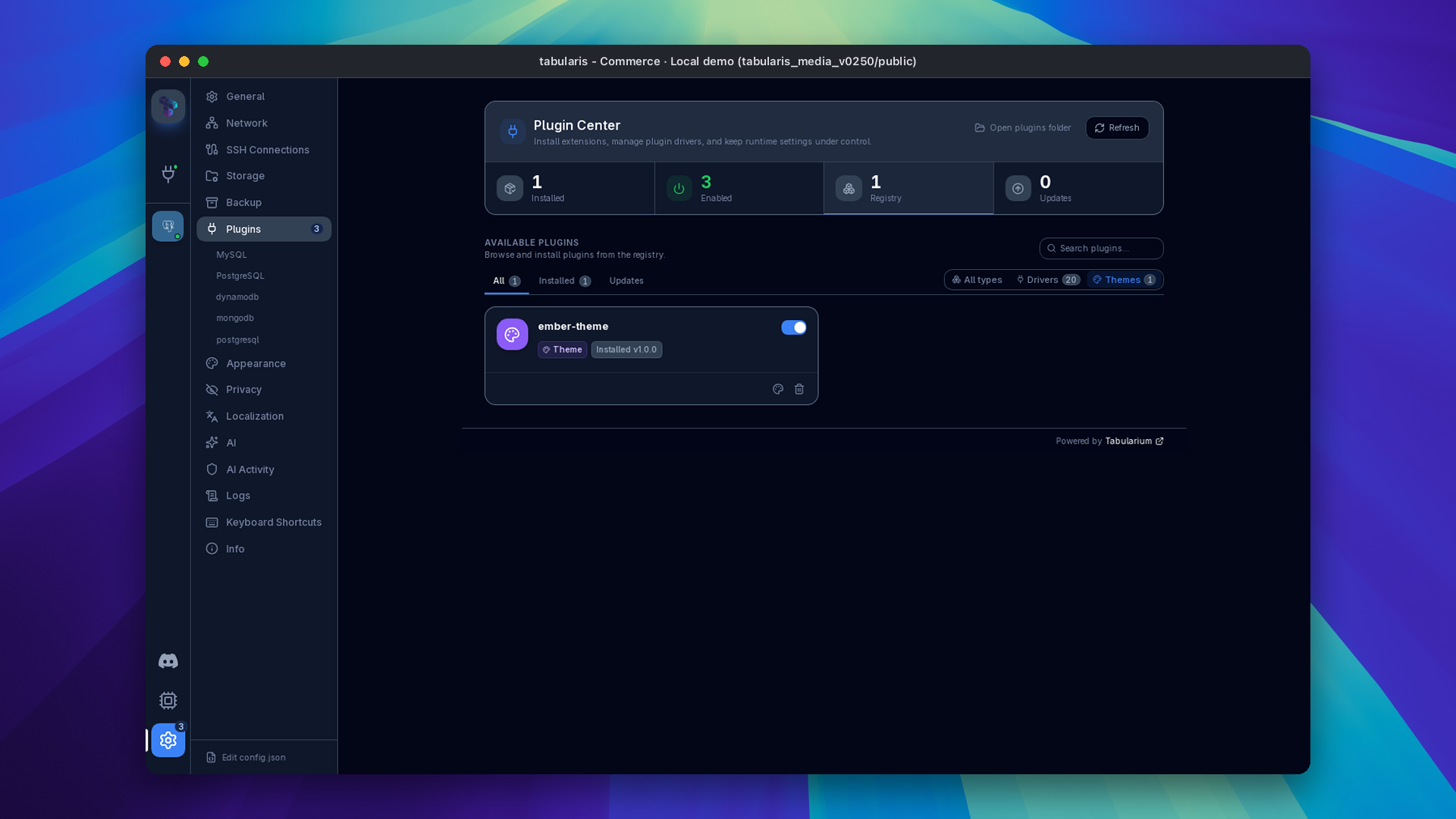
Settings → Plugins has a Filter by type control with Drivers and Themes. Theme packages published to the Tabularium registry are installed, updated, enabled, disabled and uninstalled there, next to drivers, and tabularis://install/<slug> deep links work for them too. Uninstalling a theme package reuses the plugin removal dialog and affects every variant of the package. A package must declare min_runtime_version: "0.25.0" or later; older clients refuse it.
The install lifecycle validates the archive with size bounds, checks every path and payload, stages the package privately under a lock, and commits it by atomic replacement with rollback on failure. Interrupted operations are repaired only through the explicit Recover interrupted installs action. A saved selection that points at a package that is currently unavailable falls back to a built-in theme without overwriting your preference; when the package is enabled or reinstalled, the selection is restored.
Packages are stored by kind under the app data directory, in plugins/themes/<package>/ beside plugins/drivers/<package>/. Personal themes exported before v0.25.0 remain where they were and keep working.
Authoring a theme
@tabularis/create-plugin (0.3.0, 0.4.0 since v0.26.0) ships a second binary, tabularis-theme, which scaffolds a two-variant repository, validates both variants offline with the same schemas the app uses, and builds a deterministic ZIP. The generated repository includes a read-only validation workflow for branches and pull requests and a separate draft-release workflow for tags. Theme definitions and manifests may carry optional $schema hints for editor completion; the runtime ignores them for validation and never fetches a remote schema. The full guide is THEMES.md; Ember is the reference two-variant theme.
Package identity: id and name
Since v0.26.0 a theme manifest may carry an optional id, the stable package identifier (a lowercase slug), next to name, which then becomes a free-form display name. Without id, name must still be a slug, so packages installed before keep the same folder and selection IDs. The app validates only the runtime contract (id, name, version, kind, min_runtime_version, theme_schema_version, theme_variants) and tolerates extra catalog metadata, which the registry validates with tabularium validate .tabularium --kind theme. The archive still admits only the manifest, README/LICENSE and the declared variant files.
Typography Configuration
Readability is critical when parsing logs or complex queries.
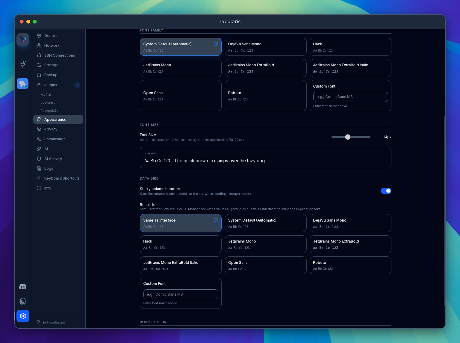
- Font Family: Settings → Appearance has two independent pickers: Font Family for the interface and a separate one for the SQL editor. Both offer the bundled families (DejaVu Sans Mono, Hack, JetBrains Mono, JetBrains Mono ExtraBold and ExtraBold Italic, Open Sans, Roboto), System Default (Automatic), and a custom field where you can type the name of any font installed on your system. For the editor we recommend coding-specific fonts like JetBrains Mono, Fira Code, or Cascadia Code.
- Result Font (since v0.24.0): Settings → Appearance → Data Grid → Result font offers Same as interface, bundled families and a custom family. It applies to result cells, inline edit inputs and multiline textareas. The default stays JetBrains Mono. The
resultFontFamilyvalueinheritfollows subsequent interface-font changes; editor, log and hex fonts remain independent. - Ligatures: The SQL editor does not render programming ligatures (such as
<=drawn as≤), even with a font that supports them. - Font Size: The interface font size (10–20 px) and the SQL editor font size are set separately. There is no font-weight setting; for a heavier editor font pick one of the bundled JetBrains Mono ExtraBold families.
CSS Variables
Tabularis applies themes by setting CSS custom properties on the <html> element. Since v0.26.0 the whole UI reads its colors, radii and fonts from these variables: status banners derive from the accents, rounded corners follow layout.borderRadius (so square-corner themes are square everywhere), the grid paints row states and key icons with the semantic-* tokens, and the ER diagram, visual query builder and notebook charts follow the theme too. The System font setting is now labelled Theme default and follows the theme's typography.fontFamily unless you pick an explicit font. The full set of variables used by the UI is:
/* Background */
--bg-base, --bg-elevated, --bg-overlay, --bg-input, --bg-tooltip

/* Surface */
--surface-primary, --surface-secondary, --surface-tertiary
--surface-hover, --surface-active, --surface-disabled

/* Text */
--text-primary, --text-secondary, --text-muted
--text-disabled, --text-accent, --text-inverse

/* Accent */
--accent-primary, --accent-secondary
--accent-success, --accent-warning, --accent-error, --accent-info

/* Border */
--border-subtle, --border-default, --border-strong, --border-focus

/* Semantic (data grid cell values) */
--semantic-string, --semantic-number, --semantic-boolean, --semantic-date
--semantic-null, --semantic-pk, --semantic-fk, --semantic-index
--semantic-modified, --semantic-deleted, --semantic-new

/* Typography */
--font-base, --font-mono, --font-result

/* Layout */
--radius-sm, --radius-base, --radius-lg, --radius-xl
Monaco Editor Integration
For built-in preset themes (Monokai, Dracula, Nord, GitHub Dark, etc.) Tabularis loads a matching dedicated Monaco JSON theme file. For custom themes, Monaco colors are derived automatically from the theme's color object. In both cases the switch is instantaneous and requires no restart.